← MEDIA DESIGN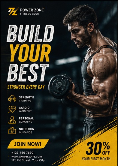
MEDIA DESIGN / 2025
CampaignPosters
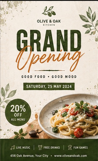
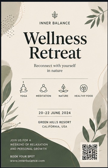
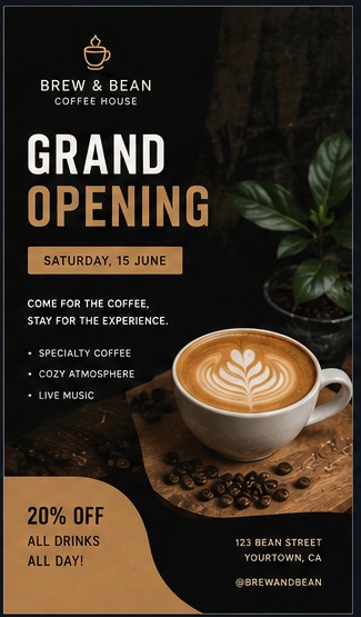
Each poster carries a complete brand in one frame: logotype, hierarchy, icon set, offer badge and contact block, arranged so the eye lands on the offer before it reads a single line of body copy.
- Poster Design
- Typography
- Brand Identity
- TOOLS
- Illustrator, Photoshop
- PIECES
- 4 posters
- FOCUS
- Hierarchy at distance
- ROLE
- Graphic Designer
CHALLENGE
Four very different clients needed print pieces that read instantly at distance while still carrying full detail — schedules, offers, feature lists, contact information.
APPROACH
Set one dominant headline per poster in a heavy display cut, pushed supporting information into a small technical tier, and used a single accent colour per brand to mark the offer and the call to action.
OUTCOME
Four distinct visual identities — industrial yellow, botanical olive, calm sage, warm espresso — each self-contained and print-ready.